You want your website to operate like a well-oiled lead generation machine, but your design might be throwing a wrench in the works. Sure, you have a fully functioning website that’s optimized for search. You even throw in some custom content a few times a week so people can find it, read it, like it and go to the conversion-oriented sections of your site to buy it. The hitch? It’s easy to let that machine become rusty or worse yet – misaligned just a touch, so that you don’t notice a problem until your metrics are dragging.
The bottom line is that you’ll never reach your ROI potential making basic web design mistakes. You might not even scratch the surface of what you could do if your website was better designed, more attractive or offered a better user experience.
Want to brush up on some UX basics? Check out the Marketers‘ Guide to UX
Bear in mind that every website is different and each business has a unique set of goals, but there are three easy-to-fix things that I’ve seen directly impact a business‘ SEO and content marketing results:
- Hiding calls to action (CTAs) at the bottom of the page
- Choosing the wrong colors for CTAs
- Putting too much information on the page
Problem No. 1: You’re burying CTAs below the fold (where people look only 20 percent of the time)
I’d encourage you to take a step back from your website and look at it from the perspective of a first-time visitor. What nav tools are actually helpful? Do you need a menu at the top and one on the side? Could your related articles be listed underneath the featured copy? By making a few small tweaks, you can clear out some space to move your CTA into prime real estate.
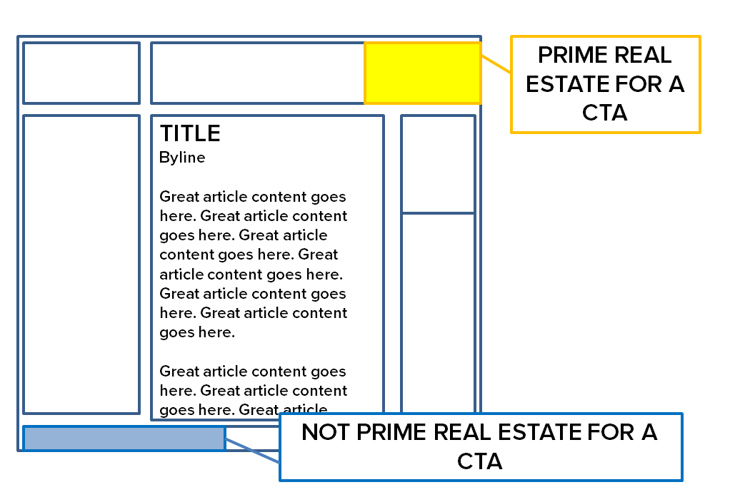 People pay attention to the content at the top of the page, also known as the space above the fold. Why? That’s where they’re used to finding the most important stuff, from featured headlines to pictures, navigation bars and quick-reference data. You have to give someone a reason to subscribe and scroll down from there (i.e. a compelling story, great writing, eye-catching pictures, etc.)
Still, webmasters tend to squish CTA buttons down near the footer of the page. In their defense, it’s because this is where there’s room on the page. After you’ve left space at the top for the business‘ name, navigation menus, content headlines, the content itself, images, archives, site search bars, related article headlines, etc., you’re down to the bottom of the page anyway.
CASE STUDY: One of our clients had an underperforming landing page that was only generating about 1.6 percent of the site’s overall conversions in a given reporting period. Comparable landings pages had much higher conversion rates – a little over 15 percent on average. The difference? The low-scoring landing page had a CTA at the bottom of the page, while the others had buttons in the top left corner (one of the places where people spend the most time looking).
Our content marketing strategist conducted qualitative analysis and found that moving the button further up on the screen could yield hundreds of additional leads for the company.
Problem No. 2: The colors on your page make your content blend in (not stand out of the page)
Your website probably has a great color scheme, but that doesn’t mean everything on your site has to totally blend in to look good. There are some website elements that have to stand out to be effective, particularly call-to-action buttons.
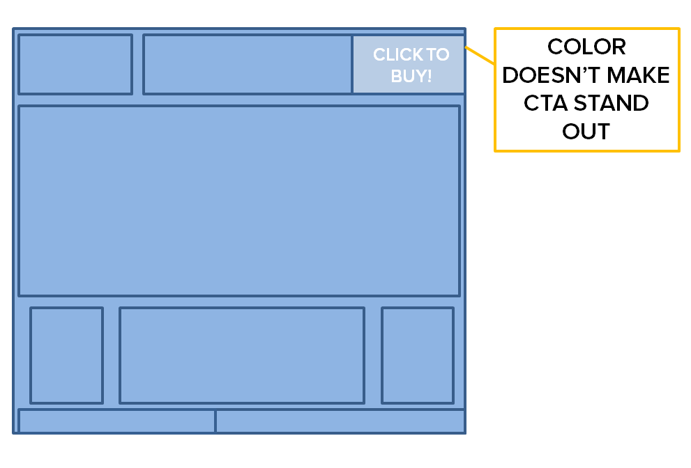
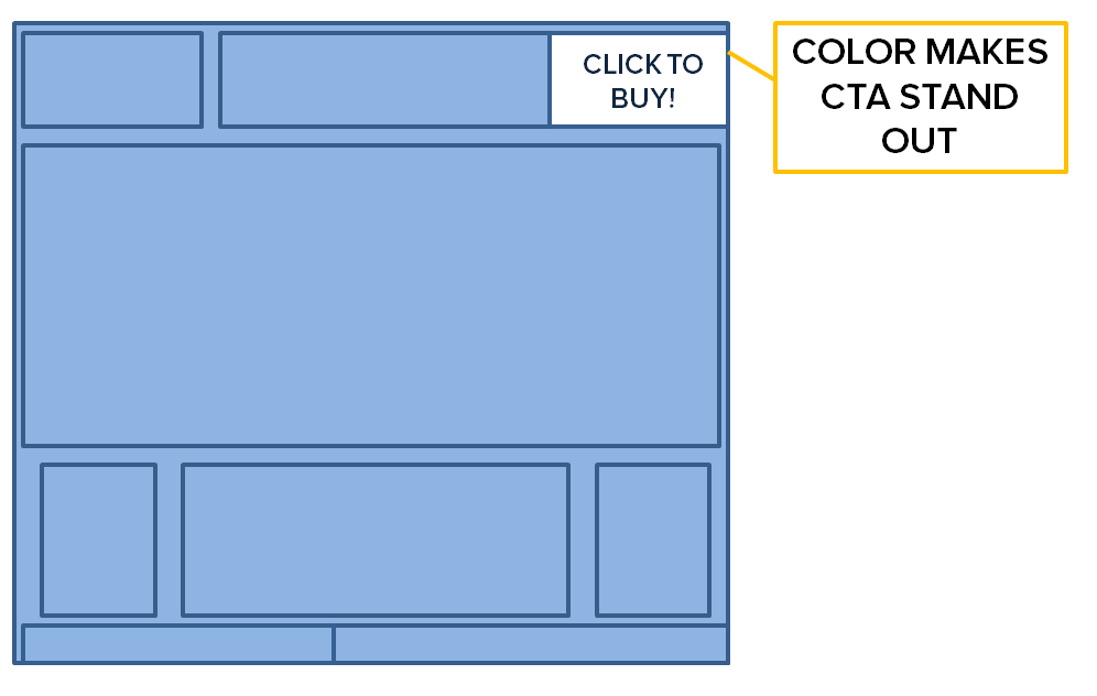
When you look at your website pages, is there an obvious next step? Is it clear what people need to do to get more information, or buy your products or get in touch with a sales rep? If it’s not – you’re probably losing conversions.
There’s a design principle called contrast, and it dictates that the most important things on the page should stand out from the rest of the content so they catch viewers‘ eyes.
CASE STUDY: A company created a CTA button for newsletter signups that blended seamlessly into the rest of the website – they were a muted version of the website’s background. the problem? People hardly seemed to notice them. Conversion rates for the „Sign up for our Newsletter“ button were low, so our content marketing strategist team drafted a bright alternative – literally. The new white button popped against the orange background, and the „Sign up for our newsletter text“ overlaid on it was now clearly visible.
The result? 100 percent more conversions.
Problem No. 3: You’re crowding the page with too much information.
In the words of Thoreau, „Simplify, simplify, simplify.“ You want to keep your website design and content marketing integration simple to get people to complete desired acts. Imagine going a page to read an article about „The most important cloud computing tips for 2014“ and you are infiltrated with offers to „learn more“ and „chat with a live representative“ and „Download our new resource“ AND „Contact us for pricing information.“ You might click away 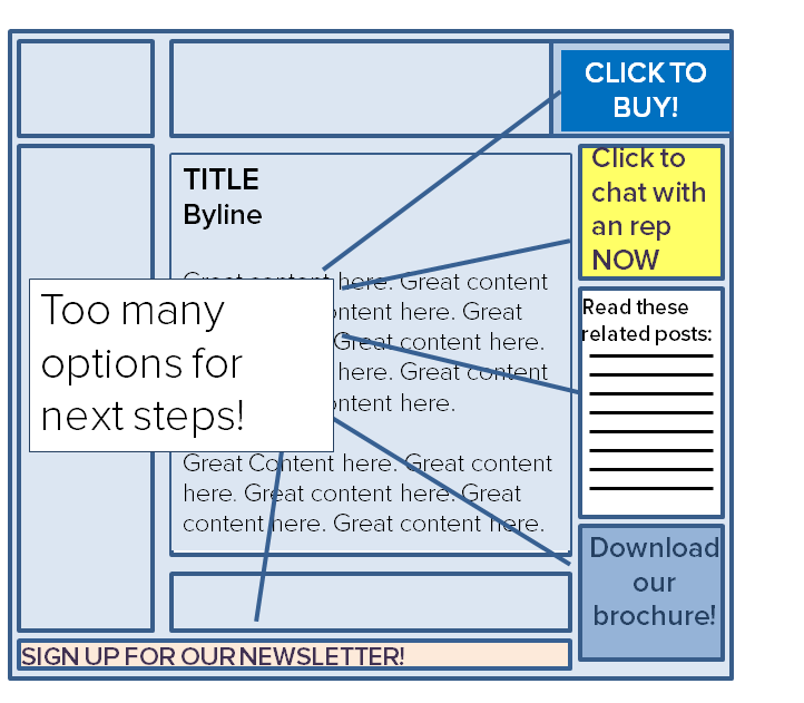 because you don’t know what to do next. There are too many options.
It’s been proven that while we, as consumers, have a „variety is the spice of life“ mind-set, we are less likely to make a decision when presented with too many choices. Brafton covered a study that found that only 3 percent of people given a sample of 24 different jams actually bought one, while 30 percent of people purchased one choice when they were only given six samples.
In this metaphor, your website content is the jam sample. And if you give visitors too many, they won’t choose anything. We’ve found that businesses‘ websites are the MOST successful when everything on the site is working toward a common goal.
Don’t believe me? Look at Uber’s website. See how clean the design is? That’s because there are really only two choices featured: „Sign up“ for the service or „Become a driver.“ It’s simple.
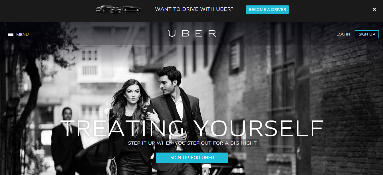
You need to figure out what people come to your website to do and make it easy to do that by adding strategically placed CTA buttons and eliminating on-page noise. After we helped a client do that, conversions jumped 146 percent and revenue increased 249 percent.
Is your lead-gen machine run down?
If your website isn’t producing the results you want, look at the big picture and keep a sharp eye on the design. The fact of the matter is, the internet today is a different beast than the web a mere five years ago. It’s a fast-paced arena and you can’t expect the same layout, buttons and visuals to produce the same outcome they did a decade ago. The best part is – it doesn’t necessarily require an overhaul. You may just need to make some minor tweaks to get things up and running again.


