As web designers learn more about how people browse and make decisions online, it’s no surprise that many of the highest-traffic sites are starting to share many of the same modern website design principles. Minimalism, flat and material design, and elegant colors and formats drive conversions by streamlining the user’s experience on the site and encouraging them to complete forms, download assets and engage with your brand.
There are many UX and UI website widgets that marketers can integrate into their sites that will help generate new leads and guide users through their marketing funnel. These modern on-page elements – from buttons to scalable images to social icons – can encourage clicks and conversions by building navigational momentum for the user and allowing them to easily engage with the site.
Effective websites are dynamic, intuitive and often visually stunning. To bring your site into 2016 and beyond, take advantage of these six interactive, on-page elements to modernize your site and boost your conversions and engagement along the way.
1. Try ghost buttons instead of ‚plastic‘ buttons
Ghost buttons are hollow or transparent buttons on landing pages that often serve as CTAs linking to digital marketing assets. They are easy to create, give off an elegant look and load fast due to their small file size. Their transparent design also lets the website’s branding shine through them, as seen in the example below from Slack.com. According to Top Design Mag, ghost buttons boast a high CTA response rate because of their pleasant, encouraging and clean aesthetic.
2. Use cards with material, semi-flat design
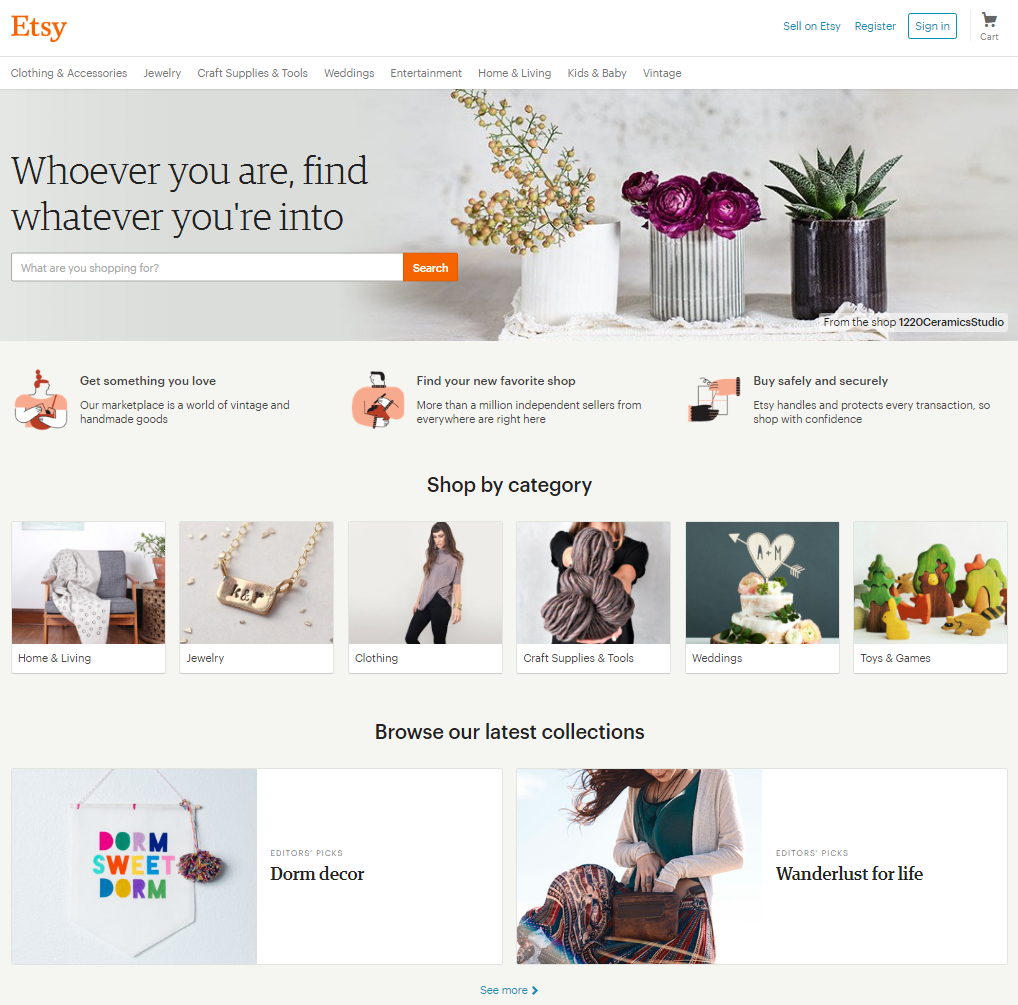
Following similar visual principles as ghost buttons, the modern online “card” draws inspiration as much from Google’s aesthetics as it does minimal Swiss Design. The popular use of cards on websites follows what is known as material design – flat and simple, but intuitively suggests order, hierarchy and mobility. They can keep up with skimmers and scanners by presenting information in small, digestible chunks. Sites like Pinterest, Hotels.com and Etsy (pictured below) take advantage of these cards to improve their sites‘ ease of use.

3. Engage users with micro-interactions
Online micro-interactions are quick, practically mindless actions, which include anything from clearing a Facebook notification to moving a slider to swiping down on a mobile page to refresh. Micro-interactions help to make your page more tactile, engaging and human. This helps keep the user involved at several stages throughout their journey and facilitate a connection between them and the machine.
Micro-interactions are the glue that keeps your audience using your site. The Next Web explained that users learn to love a product based on how it feels to interact with it – it’s “the details that make users love or hate an app or website.”
4. Make your page scalable
Use scalable vectors to ensure that your graphics and videos look uniform across platforms. When a page looks beautiful, and loads efficiently, users will have an easier time interacting with your content, and their path to a conversion will be easier. Large, bold graphics look great on a website, but there’s no magic image size that will satisfy the dimension of every computer screen, phone and tablet.
What might work well on a widescreen display might be cropped on a phone, or illegible on a watch. You work hard to ensure your graphics and video will look just right, so make them scalable so they can reach your entire audience, load quickly and have the same effect on your customers regardless of screen size.
5. Animate your site
Modern and rich navigational animations can make your site more effective at guiding your users toward action. Whether it’s something like a simple page-load design or a slight movement when the mouse hovers over a button, the animation will give the user some momentum when navigating toward a sale or conversion. As long as they don’t hurt site performance, some larger motion animations can also help drive conversions by catching the user’s eye, assigning visual hierarchy and even displaying products.
6. Use nonintrusive, subtle icons for social


Use clean, simple icons sparingly, on only the right pages, to modernize your social media marketing efforts. Share icons should be included on blog and creative content that you want people to engage with. Follow buttons should appear on most pages, within the margins at the top or bottom of the page. For more brand cohesion, develop custom social icons that map to your site style.
Whether a social media icon is designed to get your readers to share your content or to follow you, nobody likes a desperate or intrusive plea for social interaction. In some cases, if your social icons are too prominent in the deeper-funnel parts of your website, they can even detract from your conversions because they distract (and even irritate) the user and can cause them to navigate away. Additionally, if your share numbers are low, and publicly displayed, it can act negatively reinforce your audience’s readiness to convert.
There was a time for buttons like these: ![]()
![]() And that was long ago.
And that was long ago.
Modern website elements that guide users toward conversion goals should be responsive, bold, artistic, minimal and simple. When their purpose is to remove the friction in your customer’s journey toward converting, your on-page dynamic content should make that trip as easy and natural as possible.


