Industry: Education
Content: Daily blog posts
Highlights: Adjusting content placement to increase conversions
Content is at the core of content marketing, but strategies can flounder even if the copy being published is interesting and useful. Marketers with the most successful campaigns also consider whether the information they push is visually appealing to readers.
One Brafton customer’s strategy makes a case for the importance of shifting a blog’s physical position on the page to get more eyes on it and boost the chances of conversion.
Sometimes it’s simple – better position for more conversions
 It’s easy to follow a template when creating a website and page layout designs. You may worry that users will be confused if you change the way the page looks or adjust the orientation. However, you could be missing golden opportunities to get visitors to follow the path that you know leads to more conversions.
Our strategists helped the client plan a website layout that built upon its existing strengths (impressive search exposure, continual readership and tenacious brand awareness) to forge improvements that mattered most for its business goals – increased conversions.
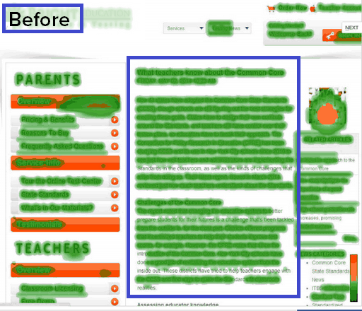
Using heat map technology to see where people spend the most time on the page, they noticed that eye-catching article images were actually directing users‘ attention away from the blog copy – and therefore, the information readers came to find.
Then, there was also a surplus of navigation tools (menus on the top of the screen and to the  right and left of the article content) that were pulling visitors in too many directions. In web design, simplicity is generally one of the best assets a company can use. It may seem beneficial to provide multiple navigation options so first-time visitors can always find their way, but it can actually be confusing and even frustrating.
A case for keeping it simple
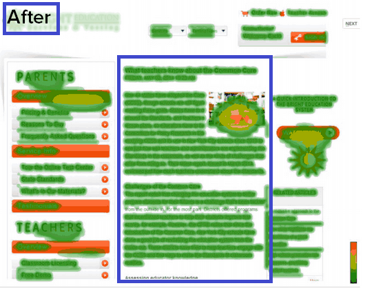
By cutting back on the number of elements on the page, streamlining the way visuals were displayed on the screen and adding a soft CTA that steered readers to a video, the client’s blog section was demonstrably better optimized for conversions.
With the same heat map technology, it was easy to see the new layout’s payoff. It would attract 66 percent more attention to the blog content and direct 73 percent more attention to the call to action on the page.
The changes to the website were subtle, but they pack a punch. Assuming readers devote more time on the content’s message and pursue related calls to action, the customer could see a noticeable bump in its pool of warm leads and ultimately generate more ROI from its domain.


