Any content was “good” content a decade ago.
But today, “good” is no longer good enough.
Not when there are more than 4 million blog posts published each day. Not when Google’s actively stealing SERP real estate for their own purposes. And not when Moz and BuzzSumo found that “75% of blog posts receive fewer than 10 shares and zero links.”
That means you need both quality and quantity to compete today.
Fortunately, that’s not an impossible task if you can use visuals to help scale your content creation. You can repurpose high-quality images, infographics and more to double or triple your output, all without investing substantially more into content creation.
Here’s where to get started.
Repurpose your existing content as visuals (and then multiply)
The easiest place to kick off is with the content you already have, i.e., content repurposing.
There’s no reason you actually need to create anything “new” in order to scale content. All you need to do is rethink how you’re using all of the existing assets you’ve already produced that are gathering digital dust at the back of your blog archives.
For instance, a few blog posts within a related series can easily be transformed into:
- eBooks or white papers for lead generation.
- Infographics for social sharing.
- Slideshare or webinar presentations.
What’s the one recurring theme that connects all of those things? That’s right: visuals.
We conducted a survey and found that 41.5% of marketers agree that infographics have the highest engagement.
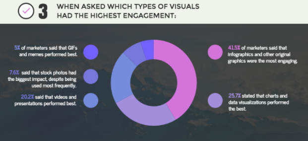
But the best part? These are insanely easy to create.
Repurpose a blog article into an infographic
All you need to do is take an existing piece of content and reproduce the same narrative with stats or facts.
In other words, you’re literally just stripping out a lot of the preexisting text and packaging just the definitive statements into a brief for a designer. Like so:
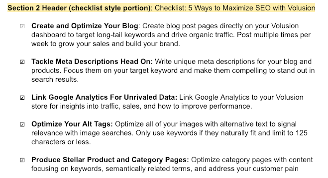
Easy, right? This is taken from an existing piece of content and run through Grammarly to remove all the unnecessary filler:
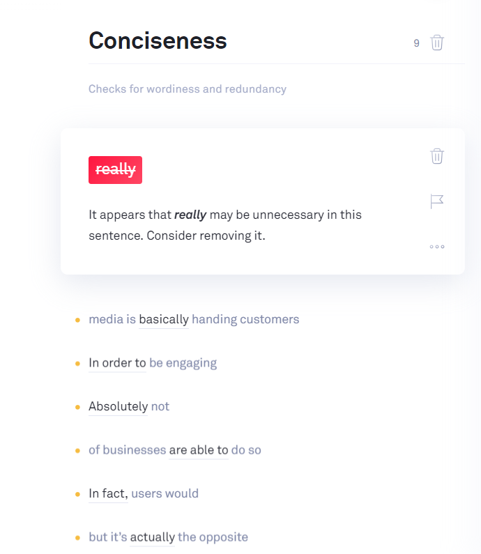
And you’re left with concise, insightful bullets to turn into a simple visual checklist.
Turn one visual into many
The next step is to literally multiply one visual into many.
For instance, an infographic can be cut down into separate sections. Those sections can be laid out horizontally across new slides of a webinar. And those individual slides can be plucked out to be turned into creative assets that promote the webinar.
Check it out:
Here’s a checklist from Freshdesk about “omnichannel customer support”:

Here’s an eBook from Freshdesk about “omnichannel customer support”:

And here’s a webinar from Freshdesk about “omnichannel customer support”:

See a pattern here?
Our studies have shown that while stock photos are still in the lead for most marketers (yuck!), original graphics and charts or data are catching up closely.
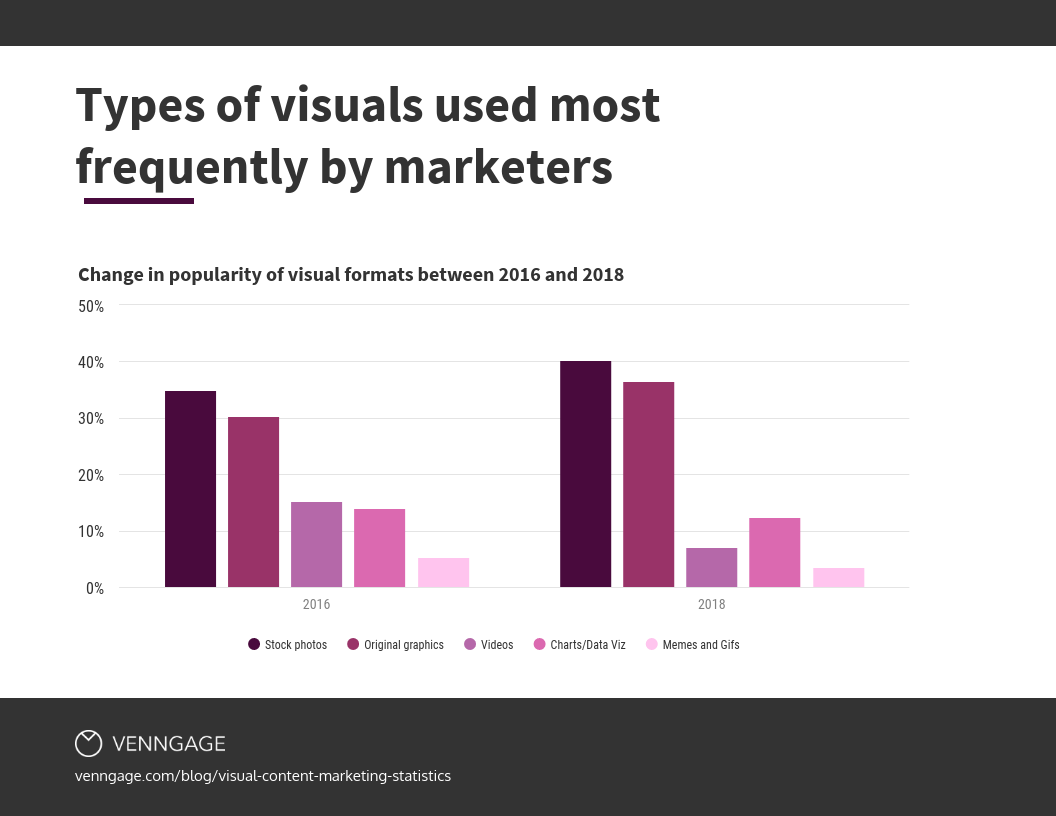
So we’re basically talking about the same thing here. Charts and data visualization are, by definition, original graphics. One can’t exist without the other. Which means there’s almost no limit on repurposing one into the other.
Visuals can make promotion easier, too.
Content marketing is more competitive than ever. More than half of businesses in the U.S. invested in content marketing in 2018. That’s up from 36 percent in 2016.
That means more investment isn’t needed on the creation side alone, but the promotion side, too.
It’s harder (and more expensive) to actually get the word out about your latest content piece. And actually get people to care.
Adding visuals to the content you already have can help cut down on the need to constantly create new stuff. But it also helps people consume, share and eventually promote your content for you at the same time.
For example, let’s say you create an in-depth resource that’s the definitive guide on a subject. That’s the approach we took with our massive guide on increasing blog traffic.
The problem is that at 10,000+ words, it’s long enough to put some readers to sleep. Especially when you consider that a whopping 43% of readers skim blog posts.
So your prose might be beautiful. However, without visuals to help illustrate your points and stop readers in their tracks, you’re not only limiting the potential consumption on the front end but also promotion on the back end.
Visuals are a fast, inexpensive way to instantly boost the perceived value of your piece, giving it extra mileage on content syndication sites like Business2Community or The Next Web. There’s no shortage of sites looking for amazing content that people will actually want to stop and read.
Take Andy Crestodina’s Blogging Trends survey. He’s been updating it for years, and recently spent 150 hours refreshing it this year.
Sound crazy? It’s not when you consider that combining original research like this with high-quality videos makes promotion and link building a breeze.
You can pump out high-quality illustrations like this:
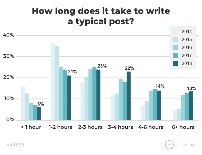
And it’s only a matter of time before random strangers pick up the baton for you, pouring gasoline on the promotional fires by sharing, tweeting and linking to your work:

Conclusion
Content marketing has never been more difficult.
There’s more content being created and less of it actually breaking through to its intended readers.
The trick isn’t necessarily creating more content from scratch, though. In fact, it’s often better to get more mileage out of the content you already have.
You can do that by adding visuals. You can illustrate the points that are already there, buried beneath dense paragraphs of plain text.
Then, you can take one visual and turn it into several visuals to hit almost every channel you’re using.
Last but not least, visuals don’t just make content “prettier.” They help readers consume what you’ve written while also making it more shareable and linkable.
Content marketing might be more difficult today. But that doesn’t mean you need to work harder – just smarter, by letting visuals do the hard part.


