Dark Mode has made its way pretty gracefully into every app, browser and device. Internet users are switching to Dark Mode settings to make the most of the benefits it presents.
Dark Mode refers to the color inversion that makes the background darker and displays light-colored text, UI elements and icons over it.
Even the email industry has not shied away from adapting to this new trend of Dark Mode.
If we go back to its inception, Dark Mode was launched in the 15th series of desktop Operating System macOS Mojave by Apple in September 2018. A year later, Gmail followed suit and brought Dark Mode support for Android and iOS devices and iOS Mail.
Dark Mode has gained immense popularity in the last couple of years.
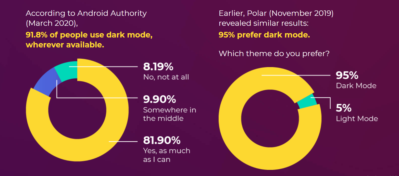
The reason for this early adoption of Dark Mode can be attributed to the advantages it comes with.
- Dark Mode is comforting to the eyes, even when the ambient light is really low.
- It reduces the screen brightness significantly, thereby helping to save battery life.
- Accessing emails on Dark Mode increases content legibility and makes content consumption easier.
- It imparts a sophisticated look and feel to the email.

Source: What is Dark Mode in Email & How to Enable in Email Clients
Despite these advantages, Dark Mode presents several challenges to email marketers and developers.
- Dark Mode might not go well with every brand personality.
- In case your email does not look ‘good’ in Dark Mode, it will lead to deliverability issues by triggering the spam filters.
- Some emails might not be accessible as Dark Mode can reduce the color contrast.
- Dark Mode email presents several rendering challenges, depending on the email client used by the subscriber.
Take a look at the image below.
Traditionally used mobile email clients, desktop and web email clients will render the email as it is, even in Dark Mode settings.
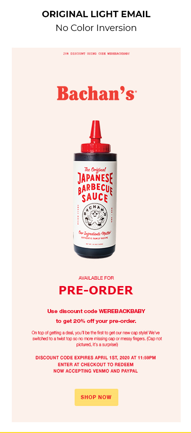
Outlook.com will render the email with partial color inversion when accessed in Dark Mode.
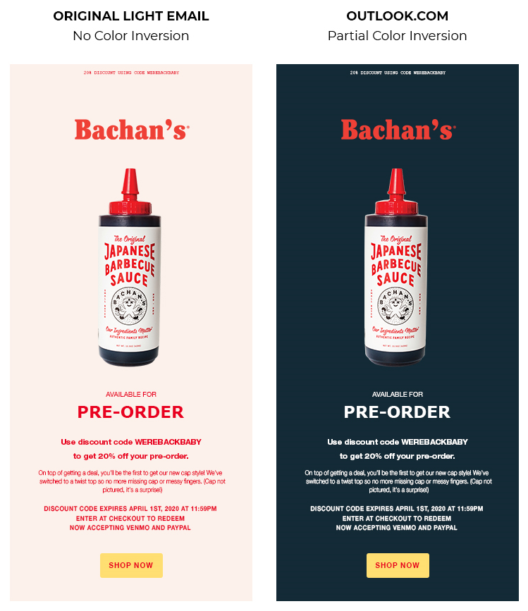
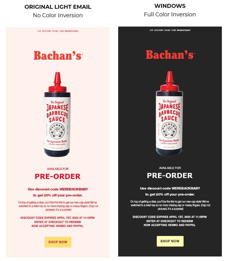
Contrarily, Windows.com will result in full color inversion and display the email like this:
Take a look at this compatibility chart to get a direction to how you must design Dark Mode compatible emails:
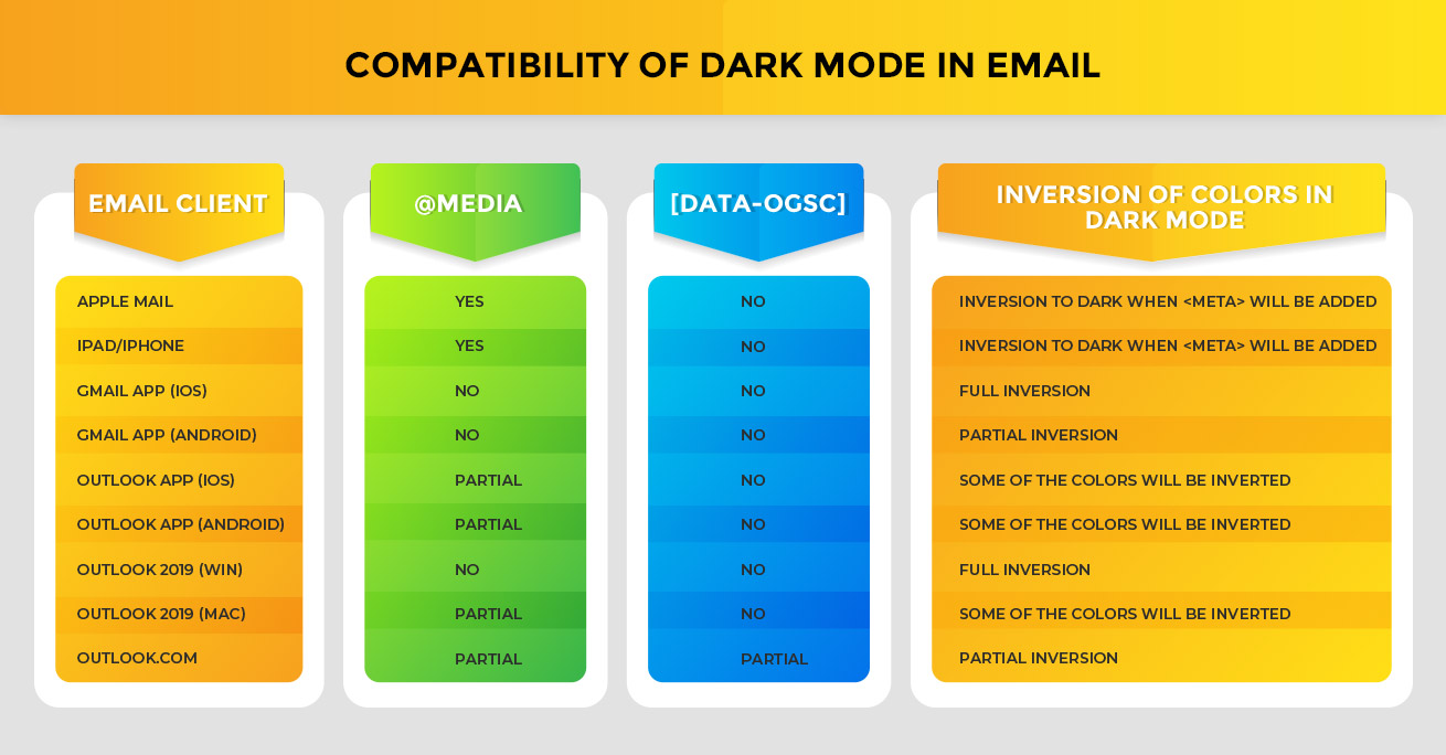
That brings us to the next question: How to design a Dark Mode compatible email?
Design Tips for Dark Mode Emails
1. Adhere to color contrast standards for accessibility.
While designing a Dark Mode compatible email, you must make sure your text is legible for people using Dark Mode. Google Material Design has suggested that the text and background must be set at a minimum contrast level of 15.8:1.
This means that darkest white fonts are most legible in a dark gray background.
2. Do not mix images and background colors.
Mixing background colors with images will lead to a broken layout in Dark Mode.
This is because when you change the settings to Dark Mode, background colors will get reversed but the images will stay as it is.
3. Saturated colors do not go well on dark backgrounds.
Using saturated colors on light backgrounds will be visually impactful. The same colors on dark surfaces will create visual vibration and make reading text exhausting for the eyes. Therefore, it is a good idea to use desaturated pastel colors that will enhance the color contrast when used on a dark background.
4. Your background must not be pure black.
Many designers believe that Dark Mode implies a pure black background and pure white text or icons. However, that is not the case. You must always use dark gray color instead of true black. It will not only be soothing to the eyes but also reflect more elevation, depth and color.
5. Do not forget your brand’s personality.
Dark Mode does not suit all brands. You must remember this fact while designing your emails. The entire look and feel of emails will change in Dark Mode, and so will the emotional appeal.
6. Add a white stroke to the logo and icons.
Imagine having a black logo on a black background. Obviously, It will not be visible, right?
To avoid such a scenario, you must always add a white stroke around the logo and icons. It will help these visual elements to stand out even in Dark Mode.


7. Transparent images in PNG format must be used for Dark Mode compatibility.
The images you use will take up the background colors on color inversion. Therefore, make it a point to stick to transparent images in the PNG format to design for Dark Mode.
Take a look at this example to understand what this means.

8. Always use “On” colors for text.
“On” colors refer to the colors that are displayed on top of components. When we talk about Dark Mode, pure white turns out to be the default “on” color. Use a slightly darker shade of white to overcome the issue of visual vibration (as mentioned earlier).
Furthermore, use lighter font weights for Dark Mode. The reason being that white text on dark background appears bolder in comparison to dark text on lighter backgrounds.
Wrap up
That sums up some of the most important things you must know before designing Dark Mode emails.
If you are looking for more insights into Dark Mode email designing and coding, Email Uplers has created an attractive infographic around the topic: In the Limelight: Dark Mode in Emails.


