So, here we are – you’ve tried all kinds of content within your marketing strategy, working to offer up insights and to educate your target audience. You’ve been buzzing right along until things start to feel a bit … stagnant.
Blogs have been done – you’ve got pages of them. You have a few, more in-depth assets to offer your audience in the way of digestible eBooks and formal white papers.
But, still, you’re looking for something to shake things up. And infographics might provide juuuust the thing.

What’s in an infographic?
It’s a question worth asking, but chances are good that you’ve seen an infographic before. These informational graphics (see what we did there?) provide a small amount of written content, and are typically very stat-heavy. However, there are all different kinds of infographics – some include numerous statistics and some are more narrative in their approach. All infographics include key graphical elements that help tell a story through the thoughtful design, display and layout.
In other words, they’re like a data visualization, but better. Let’s take a closer look:
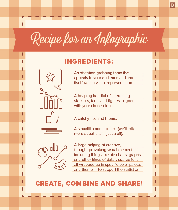
Recipe for an infographic:
Ingredients:
- An attention-grabbing topic that appeals to your audience and lends itself well to visual representation.
- A heaping handful of interesting statistics, facts and figures, aligned with your chosen topic.
- A catchy title and theme.
- A smaallll amount of text (we’ll talk more about this in just a bit).
- A large helping of creative, thought-provoking visual elements – including pie charts, graphs and other kinds of data visualizations, all wrapped up in specific color palette and theme – to support the statistics.
Create, combine and share!
If only it were that easy.
The best infographics incorporate telling statistics and facts alongside strong visuals. They can be short, sweet and to the point, or longer and more in-depth, depending on your audience and their preferences. In this way, infographics can provide a great way to break down complex topics, or to visually display information while providing more context than just a graph or section of text.
However, it’s not just about plopping a bunch of numbers into a doc and handing it off to a designer.
There are certain best practices that you should observe during the infographic content creation and design processes that can help your assets really sing.
Pick a topic that speaks to your audience
Just like with any other kind of content you create, you have to pick a topic that’s in line with your audience’s interests. This takes some research, but you should consider trending topics and subject areas that will grab the attention of your target persona, and those that provide a connection to the services your company offers.
You should also consider how well the topic will lend itself to the infographic process. Remember, these are stat- and fact-heavy assets that have more visual elements than copy. So choosing a topic that offers lots of opportunities for impactful statistics and bold facts will make the process much easier.

Research and find your facts and stats
Because infographics rely on just a few data points to get the message across, it’s important to find statistics that tell the story of your topic – but also come from a reputable source.
Market studies, industry surveys and things like this are good sources to start with. But it’s also important to think outside the box and ask yourself, “What is the message I’m trying to send, and what kinds of stats and facts support it?”
As you do your research and find your data points, consider how they will be displayed and laid out for the reader. We’ll get into this more in a bit, but taking the time to think about design, theme and layout as you’re researching and creating the content can make the actual design much easier.
Create the copy – but let the numbers speak for themselves
Okay, here’s where it gets a little tricky.
When it comes time to incorporate your stats into the actual copy, remember: Show, don’t tell. If you feel the need to include big, wordy sections to support your stats and facts, something’s wrong.
And don’t forget – a lot of the context and understanding will come from the data visualizations and graphics added during design. So don’t worry if you take a look at your written content (i.e. infographic outline) and it feels incomplete.
“No one wants to really read a LONG chunk of text,” Brafton Senior Designer Courtney Meyer explained. “If you think about it, looking at a long paragraph of text on a computer isn’t very inspiring – I might actually fall asleep trying to do so. Smaller pieces of text, combined with unique, yet appropriate imagery is much more effective at capturing the audience.”
We’re creating an infographic, so we want it to be informative and graphical – but definitely not text heavy. Infographics can be much more interactive than a blog, white paper or other piece of written content, and encourage readers to explore facts and figures through fun, visual designs. Weighing everything down with unnecessary text won’t just turn off your readers – it’ll make this really REALLY difficult for your designer.
As a rule of thumb, I always like to take a second, third and even fourth look at my written text outline before handing it off to one of our in-house design wizards like Courtney, who then work their magic. This gives me the opportunity to take a step back and cut any text that isn’t necessary.

Don’t forget a call to action
An important part of any piece of content – infographics included – is the call to action. What next step would you like your audience to take?
The CTA will depend largely on the topic of the infographic, but some to consider include:
- Download the app.
- Visit our website.
- Read/learn more.
This can be a great opportunity to point customers to your services and offerings, if they align with the graphic, or provide more materials for them to read and peruse on the same or a similar topic.
Get themey!
Infographics should always have a theme – and no, this isn’t the same as your topic, although your topic should definitely inform your theme.
Your theme and its connected design serves your infographic in a number of different ways, including helping to make your graphic more memorable and sticky for readers. This little gem from LinkedIn uses a food theme for its blog content infographic – talk about catchy and original!

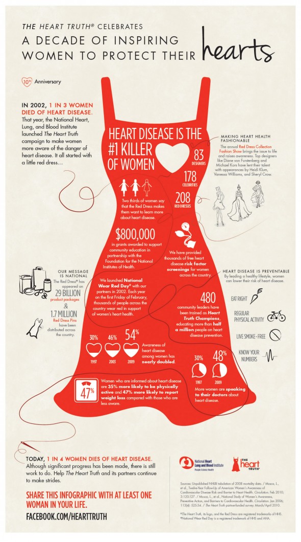
Another great example is this fantastic infographic from the National Heart, Lung and Blood Institute. It borrows the iconic red dress image that’s become synonymous with women’s health thanks to the American Heart Association’s Go Red for Women campaign. Data points are displayed creatively in way that allows readers to explore and educate themselves.

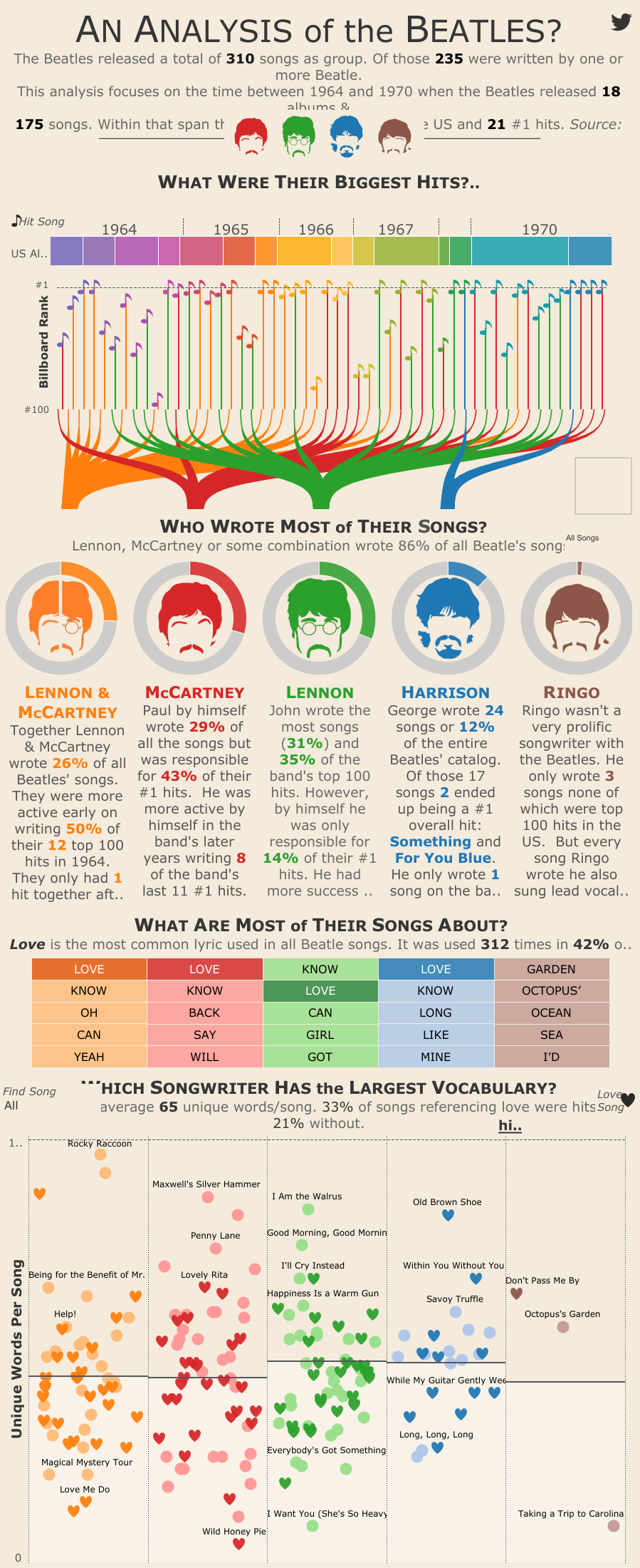
Another example of form meets function in the way of theme comes from this groovy graphic from DuelingData, which breaks down the Beatles’ catalog in terms of author/composer.

Aww, Ringo.
Pare it down
Remember when we talked about showing and not telling? I’m here to hammer that home.
Before moving on to design, take one more look at your copy. If there’s anything that can be cut because:
- It’s too wordy.
- It’s unnecessary.
- You need more room for data visualization/graphical elements.
Now’s the time to lose it.
Time for design: Tie everything together in the context of your brand
Now that the content and theme is squared away, it’s time to think about your color palette and potential for branding.
“Branding is everything when it comes to designed collateral,” Courtney noted. “Unless clients don’t mind straying from their branding (which is also fine – this can sometimes mean the graphic is more creative), we want their website to look cohesive as a whole. This means figuring out their exact brand colors, their design style, their fonts, etc., and using those in the infographic.”
So, for example, if your brand uses a blue and green color scheme, you should look for places where these recognizable colors can be worked into the visuals and design.
Share that baby all over the place
Alrighty! The designers have worked their magic, and we’ve got a completed infographic in hand!
But, your work’s not done quite yet. Now it’s time to promote this beauty. A few tips to observe here:
- Don’t post the whole infographic to Facebook or other social media. As CoSchedule contributor Brandon Weeldreyer pointed out, this results in a small strip of an image surrounded by dead space. And after all the work that you and your team put in, we can surely do better. Cut the graphic into a smaller portion – consider a 2:1 ration to create a nice little piece of microcontent that’s just perfectly shareable – or create a custom preview image.
- Support it with a blog. Remember all of that written content that you cut out (or didn’t even include in the first place)? Fear not! You can still put that info to good use by leveraging it in a supporting blog based on your infographic.
- Take inspiration from others – but don’t be afraid to try something new. As Courtney explains, “I think it’s great to always be looking at inspiration – various infographics that are already out there. I love seeing new layouts that inspire my own work. At the end of the day, you want to challenge yourself, but at the same time create a piece that is unique and engaging and out-of-the-box creative!”
Ready for more? Check out our ebook on the different types of infographics you can try.


