What’s the first thought that crosses your mind when you open up an article and are greeted with a stock image of three businesspeople pointing at a graph on a whiteboard?
Boring. Safe. Uninspired. No thank you.
Stock images prime a reader’s brain for stock content. It doesn’t matter if you have a Pulitzer Prize-winning piece desperately seeking eyeballs below that image – no one is ever going to see it if you have primed them for blandness.
So… if it’s such a bad idea, why have we been doing it for years?
It’s simple. Five years ago the market was getting saturated with text-heavy news and blog content. All text, all day. We needed something visual to break apart the walls of text in order to maintain our short attention spans. Cue: stock images. It worked. It added a visual element that was (somewhat) related to the text.
Studies show that Facebook posts with images get 2.3 times more engagement than those without. We are visual creatures, indeed.

But before you knew it, the web was flooded with images of businessmen writing jargon on glass windows. What used to be a good technique to capture attention on-page, or in a social media link, has become a warning sign that says: “We couldn’t come up with any interesting visuals for this content. Oh, and this content might not be interesting either.”
Well… what happened?
We killed stock images. No, seriously, we killed them. Everyone in digital marketing has blood on their hands, and we are as guilty as the rest.

The audience started to demand more relevant content (as it should!). We demand that content provides value from top to bottom. It’s no longer just about the words written on a page; it’s about how those words are formatted and the choice of embedded media presented at the right time during the story.
There is simply no room for content for the sake of content.
We. Don’t. Have. The. Time.
We have had a taste for sweet, sweet valuable content, and we aren’t turning back.
Prove it, tough guy!
One of our clients in the B2C technology sector has a blog that performs relatively well, driving roughly 13,500 visitors per quarter. The average blog brings in 75 visitors per quarter, not bad. For top-of-funnel awareness, the blog is doing a fine job.
It’s fine, not spectacular. And spectacular is what the market craves.
So we looked over the articles – a simple subjective inspection of the content. The stock images stuck out like a sore thumb. For B2C, it’s particularly blatant. And even more so for clients that have edgy brand voices.
We determined that the blog articles needed custom graphics that could serve as the teaser image in social media sharing and be embedded in the content to better convey the a concept. In just three months and with 15 articles, we saw the following results:
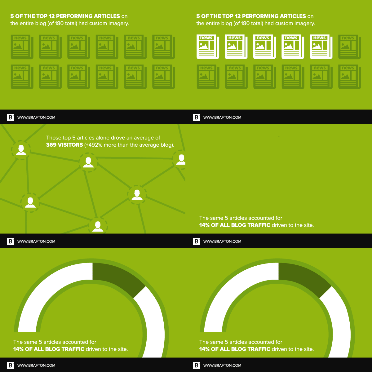
- Five of the top 12 performing articles on the entire blog (of 180 total) had custom images.
- Those top five articles alone drove an average of 369 visitors (+492% more than the average blog).
- The same five articles accounted for 14% of all blog traffic driven to the site.

Need more proof?
- Infographics are „liked“ and shared on social media 3X more than other any other type of content.
- Researchers found that colored visuals increase people’s willingness to read a piece of content by 80%
So… Do I burn all my stock photos?!
Listen, you’re not going to be able to create hyper-relevant custom graphics for every blog post. It’s unrealistic, and it can get expensive. We are guilty as well; with the amount of blogs we write, it’s unsustainable to create a custom image for every single blog post. So when you have to use stock images, make sure of two things:
- They aren’t overly stock looking.
- They are as relevant to the topic as possible.
But when you can create custom images, do it. Intuitively, you know it’s the direction of the market. Scientifically, the data backs up that intuition.


