Industry: Staffing
Content: Blog posts
Highlights: Bounce and exit rates decrease, engagement improves and conversions increase
To be highly successful with content marketing, what you publish has to be a triple threat: Entertaining, educating and selling readers. It’s not easy to hit all three of these objectives in a single blog post, but companies are fine-tuning their content strategies to do just that.
As one of our content marketing strategists put it, it’s the difference between giving readers a newspaper or magazine experience. The former relays information in a just-the-facts format. The latter tends to be more immersive, and that’s typically what blog readers are looking for.
Companies with the best content marketing strategies provide these kinds of experiences to web visitors. They’re taking a dual approach with in-depth written pieces that feature attractive visuals keep readers engaged.
Goal: Build traffic and increase engagement
One of our staffing clients had high expectations for its blog content. It was looking to bring in new traffic, but also wanted to increase engagement. The company understood this was the path to deeper-funnel goals like thought leadership and conversions.
It’s the difference between giving readers a newspaper or magazine experience … the latter tends to be more immersive, and that’s typically what blog readers are looking for.
To help them build reader engagement on traffic-driving pieces, we made strategic changes to make sure the content was holding readers‘ attention.
Strategy: Produce articles with deeper analysis, better visuals
To make the blog articles more engaging, we challenged the client’s content writer to dive even deeper into the subject matter. The articles needed to provide thoughtful analysis on job trends on top of straightforward reporting.
In addition to a more comprehensive look at trending staffing stories, we also revamped the look of the blog to make it a better visual experience for visitors, adding:![]()
-
Inline images
-
Pull-quotes
-
Subheaders
-
Custom info images created by our graphic design team
These features help to showcase the content by providing context for the stories. A stat doesn’t have to stand alone if you can create a visual that shows visitors what it means and how it should be interpreted. This makes the reading experience easier, and therefore, more enjoyable. And ultimately, this is the secret to increasing engagement and building a successful marketing strategy.
Results: Visitors stay on the page and convert more often
By fine-tuning this company’s content strategy with deeper analysis and stronger visuals, we started to see significant improvements in engagement metrics:
-
Bounce rate is 59 percent better
-
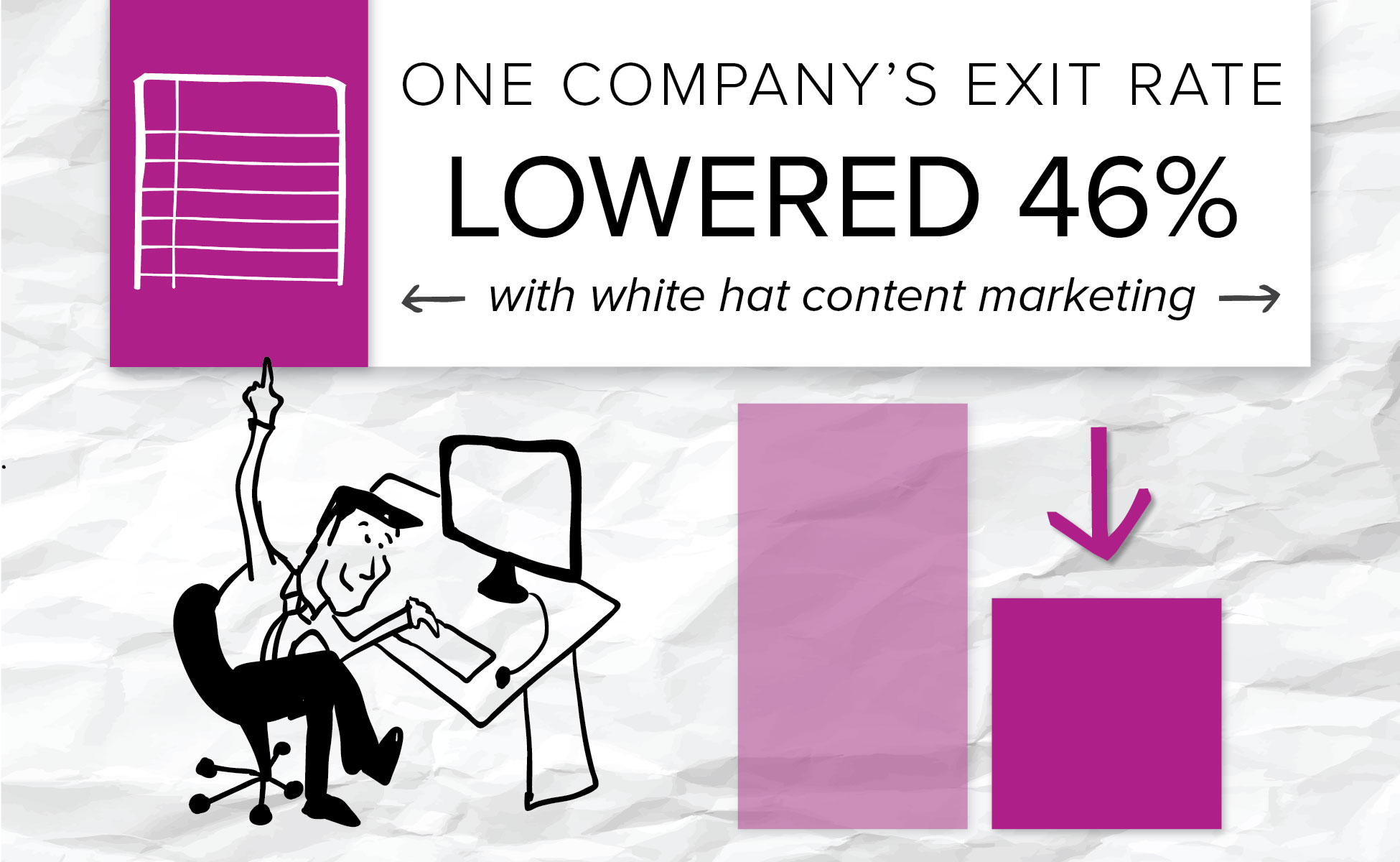
Exit rate is 46 percent better
-
Abandonment rate dropped 11 percent
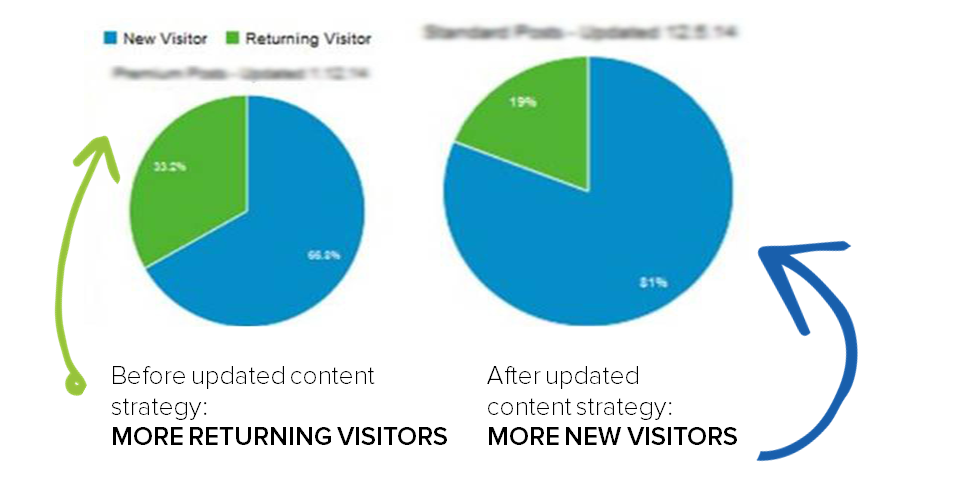
Visitors weren’t just clicking the headlines and leaving the pages once they got a snippet of information. They were sticking around to read the entire story and then digging deeper into the site.
The look of the site and quality of the information was keeping readers attention, but it was also encouraging them to engage further, learn more about the company and go on to convert:
-
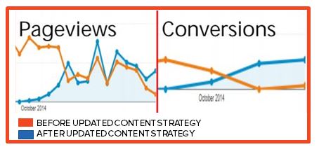
Readers read 88 percent more pages/session
-
Visitors stay 109 percent longer
-
25 percent more conversions per month
Dedicated readers demand better content experiences
If you want to attract highly engaged readers, you need to create content that will keep them entertained, educate them on topics they care about and convince them they need to learn more. It’s a tall order that requires a significant investment of time and resources.
Brands that can deliver on all of these components will earn loyal readers who are highly engaged in their message and more likely to convert.
Here’s a look at how our editorial team uses images and written content to improve the user experience on websites.


