Industry: Automotive services
Content: Landing page and social ads
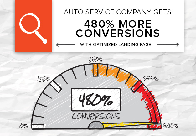
Highlights: Optimized landing generated 480% more web conversions
What do you do when your biggest – and most productive – promotion just isn’t having the same effect it once did on prospects? You take a fresh approach. An automotive services company recognized that it needed to stop taking small steps forward with its web marketing, and make a giant leap that would reinvigorate interest in its top offers.
The risk paid off. Within a month of revamping a campaign, the company was getting over 480 percent more conversions.
It all started with interest in how a content marketing strategy could support the company’s marketing goals. Consistent blogging is a proven way to drive more organic traffic to your website, engage visitors as they learn about your business and seal the deal by creating natural pathways to convert.
Initially, the auto company partnered with Brafton to build a blog, and quickly learned the scope of content marketing stretched beyond written articles. In addition to contributing posts for its blog, we also picked up where the brand left off in creating video content, illustrative graphics and promoting assets on social media.
A look under the hood revealed old, broken parts
Our content marketing strategists also took a close look at the company’s primary promotion (which offered a free service in exchange for users‘ contact information) as we made targeted recommendations for the business‘ website. We noticed a few things on the campaign’s landing page that set off red flags:
- There was a big image that took up most of the space above the fold
This is a faux pas because it’s the only thing people can see when they click the link to view the page. Ideally, you want the most important information front-and-center so users can quickly get what they came for and take action. - The form was set up with too many questions, with a ‚pushy‘ request
Originally, the form was set up to push SMS messages to visitors who signed up. While the company was having some success with this, it was probably too big of an ask on the first interaction. Generally, the more questions you have on a form fill, the less likely people are to fill it out. - The landing page included a main navigation bar
This additional navigation feature didn’t benefit the user experience because it took up space above the fold and suggested users should be navigating AWAY from the page, instead of staying on it to fill out the form.
We recommended that the company streamline the landing page to make it more appealing to visitors, and also easier to use. Specifically, we suggested:
- Removing the nav bar
- Moving the form further up on the page and removing the large image
- Asking for less information on the form and moving away from SMS-outreach
Once the page was cleaned up, we started to see just how effective the offer was.
A quick tune-up turned the website into a conversion machine
Within a month, the web conversions on the landing page jumped over 480 percent. That means that five-times the number of people were filling out the form to participate in the promotion – and giving the company their contact data.
Was the offer any sweeter? No, it was the same incentive. The only difference was that the page had been optimized to appeal to visitors. We gave them a better user experience and they responded.
This content marketing engine is just warming up
Now that the form is clearly resonating better with visitors, we’re looking to drive more people to the page so we can exceed this initial success.
Social media is a particular area of interest for the company because it has an engaged audience there already. We plan to do more campaign promotion through social media ads on Facebook and Twitter that will reach a wider audience of potential customers to drive even more conversions on the site.


