If your website design doesn’t support the content you’re publishing, you’re getting in the way of your own results: 48 percent of users say site design is the no.1 factor in determining if a company is credible. While pretty design is important, navigational ease is what’s really key. In fact, a Google study found web users prefer simple, logical sites over complexity. To make sure we put your company’s best face (and content) forward, we offer technical services that not only include API delivery of your premium content, but also integration and design to display content on an optimized website.
At Brafton, we’re advocates for bridging the gap between tech and marketing teams. Implementing a web presence that drives brand awareness has never been in higher demand – but often that includes a behind-the-scenes hero who will be necessary to bring these content facets to life. At Brafton, our web development team works alongside clients’ tech teams to provide integration best practices.
Our technical services reflect a clear trend we’re seeing in customer demand, and overall best practices. We recently reported that over two-thirds (65 percent) expect to increase their marketing technology budgets in 2015. It’s clear marketers are thinking more about tech than they were in the past.
Here’s a look at what’s included in our technical integration services, with insights straight from Lead Strategist Hollie Farrahi about why we recommend these best practices:
Branded favicon on blog landing page and article page
Why we recommend it: This will allow desktop users to attach a visual representation to your brand and website.
![]()
Consistent breadcrumb URL
Why we recommend it: This shows logical hierarchical structure to search bots so the bots can connect the „topical dots“ of your content. This is also helpful for users who want to know where they came from and where they’re headed next.

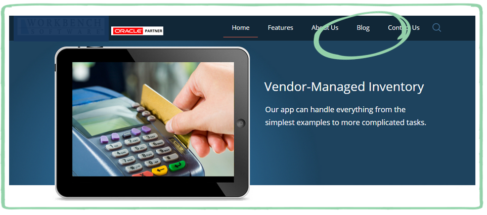
Main navigation has a link to the blog
Why we recommend it: You don’t want users to have to dig for your fresh content!
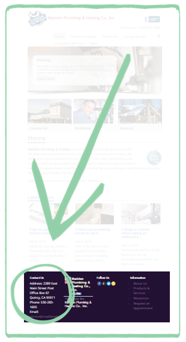
NAP (company name, address, phone number) in footer
Why this is necessary: Users have become accustomed to finding this information in the footer. Displaying the info here minimizes the clicks needed to get to it, too.
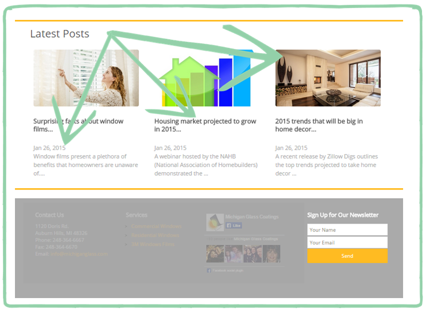
Top 3 headlines located on the homepage
Why we recommend it: Google indexes your homepage more often than any other page on your site. Because of this, providing links to your freshest content on the homepage results in accelerating the content indexation process. Plus, adding fresh headlines to a homepage shows visitors that the site is actively maintained. And wouldn’t you feel more comfortable giving contact information or credit card info to a site that’s being monitored regularly?
Social media icons
Why we recommend it: It’s 2015, and users expect brands to be active on social media. Publishing social profile links on your homepage provides quick and easy access to your social media activities. Consumers are more likely to trust a brand with a social presence – a Ballihoo study said 63 percent of consumers who search online are more likely to use a business that’s on social media. Having your social presence displayed on your homepage builds into that credibility.
![]()
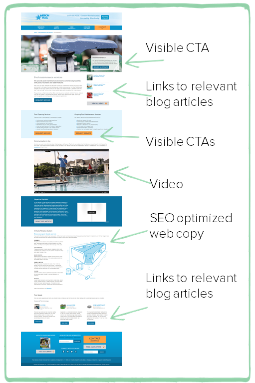
Search landing pages
Why we recommend it: Well-written, optimized search landing pages act as content-rich entry points to a website – and our teams can build them on the back-end to be sure they’re easily discovered. A search landing page written about a specific topic will more closely and effectively answer a user’s search query than will a homepage. Including strong calls to action on these pages will guide the user down your marketing funnel.
Last but not least: Google Analytics enabled site wide
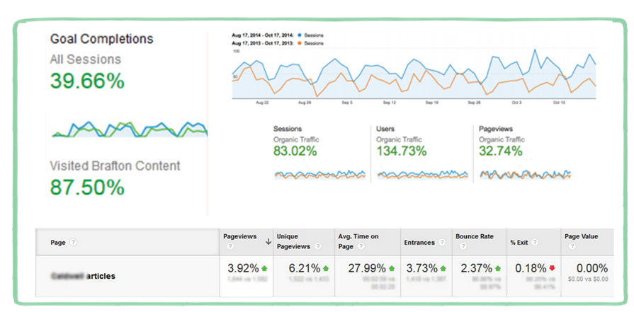
Why we recommend it: This is crucial to the ongoing adjustment of your content strategy. Both simple and complex site metrics act as justification for specific content plays – whether it’s tracking who clicks on a button when, how long a user stays on a page or what pathway they took through your site and why.
